Major Platform Update: Collections 2.0

Video Link: https://mediazilla.com/KSBK2asHlL
Advanced Collection Customization
(6 - 8 minute read)
Hey, Jon Geddes here, Co-Founder of MediaZilla, and today we’re taking a look at all the amazing new features that were recently released over the last couple months for collections. These changes are so big, we can call it “Collections 2.0”. So if you checked out MediaZilla in the past, you definitely need to take another look.
Collections are of course a way to present and deliver one or more videos with a slick customized menu system.
Let’s start with the Collection Editor.

The interface was redesigned to be more intuitive and make room for tons of new features.
At the top you have your basic controls to exit the editor, publish changes, preview, add things to the menu like titles, videos, and submenus. On the right you can bring up the collection’s settings.
On the side panel we have a Navigation tab, a Design tab, and a Music tab.
The navigation tree is pretty straightforward. You can click on the different menu pages to navigate to them or click on the videos to open their settings. It also allows you to visualize the structure of your menu which is super helpful.
The music tab is also simple. You can upload music that will play in the background as your viewer navigates the menus.
The Design tab is where you can customize the appearance of your menus and where we’ve added a bulk of the new features.
Starting at the top, it displays which menu page you are editing.
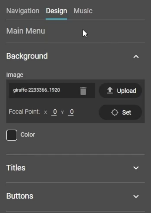
Below that are the background settings. Here you can upload an image or specify a solid color.
We also have this new option to specify the focal point of your image. This is so cool! Let me show you how it works, and we’ll also take a look at another new feature to demonstrate.

As you may know, when you have a main subject in an image, in this case a giraffe, you rarely compose it in the center of the screen when in landscape orientation. Generally you follow the rule of thirds, placing the main subject within ⅓ of either side.
It looks great here, but what if your viewer is on a mobile device in portrait orientation? Let’s take a look at one of our other new features to find out.
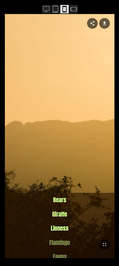
On the preview screen, you can now toggle between different device views to see exactly what that looks like.
As you can see (first image), my main subject is completely cropped out of view on a mobile device. Well that’s not good. So we’ll use the new focal point feature to fix that.
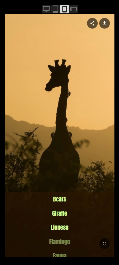
Click on ‘Set’ next to focal point, and you can now specify the main focus of your image to ensure it never gets cropped out of view. We’ll click on the big giraffe and ‘Apply Changes’. And now when we preview it in mobile portrait view (second image), our giraffe is smack in the middle. I love this feature!
This also works great with portrait oriented images.

Let's change the background to a picture of the Mona Lisa. You can see right away on a typical desktop or TV screen, the face is getting cropped off.
Normally you would just crop this image to 16:9 around the face before uploading. But if you do that, it would get cropped again when viewing it in portrait orientation resulting in double cropping and a super zoomed in image.
Instead, let’s set our focal point on the original portrait image. Select the middle of the head, just below the eyes, apply changes, and boom! Looks great in landscape, and when viewed on a mobile device, you get to see more of the image in its original portrait orientation instead of it being super zoomed into an already cropped image of the face. This should save you tons of time and result in a better viewer experience.
Let’s move on to the titles.

You can now add up to two titles per menu page, position them anywhere you want (for landscape buttons), and customize their styling independently, including the font color and drop shadow. The titles stay within the safe area of the screen, and snap to the edges, the center, and the top or bottom of the button navigation.
And last we have the button configuration.

Previously there were only 3 button styles and it was very limited. There are now 56 button style permutations with infinite color options and control over the positioning of the buttons.
Per page, you can now:
Toggle between vertical and horizontal button direction
Move the button position with a slider
Control the font color, the background bar color with transparency, and the highlight color
Toggle the background bar on or off
Round the corners of the buttons
Toggle thumbnails on or off
Have the titles display inside or outside the thumbnails
And Change the shape of the thumbnails
All these options give you tons of control over the layout and style of the menus to better match your brand and make them unique.
That’s it for the collection editor, but that’s just the half of it. Now we are going to take a look at The Collection itself.

We’ve completely refactored the button scrolling to provide a significantly improved user experience. On touch screen devices you can now swipe across the menu buttons to scroll super fast and more easily.

On desktops, you can now use your mouse wheel, trackpad, or even the arrow keys on your keyboard to scroll through buttons, for both vertical or horizontal. This makes it so much easier to quickly navigate through large numbers of buttons. It makes a huge difference!

Another big change is that collection menus are no longer fixed to a 16:9 ratio, allowing them to take advantage of the viewer's entire screen or embedded area. Normally this would cause the subject of your image to be cropped off in certain scenarios, but now in combination with the new focal point feature, your backgrounds will always look good regardless of the viewer's screen orientation or aspect ratio.
After making this change, we also went through and improved the layout of the buttons and titles in every possible screen resolution and aspect ratio, especially mobile.
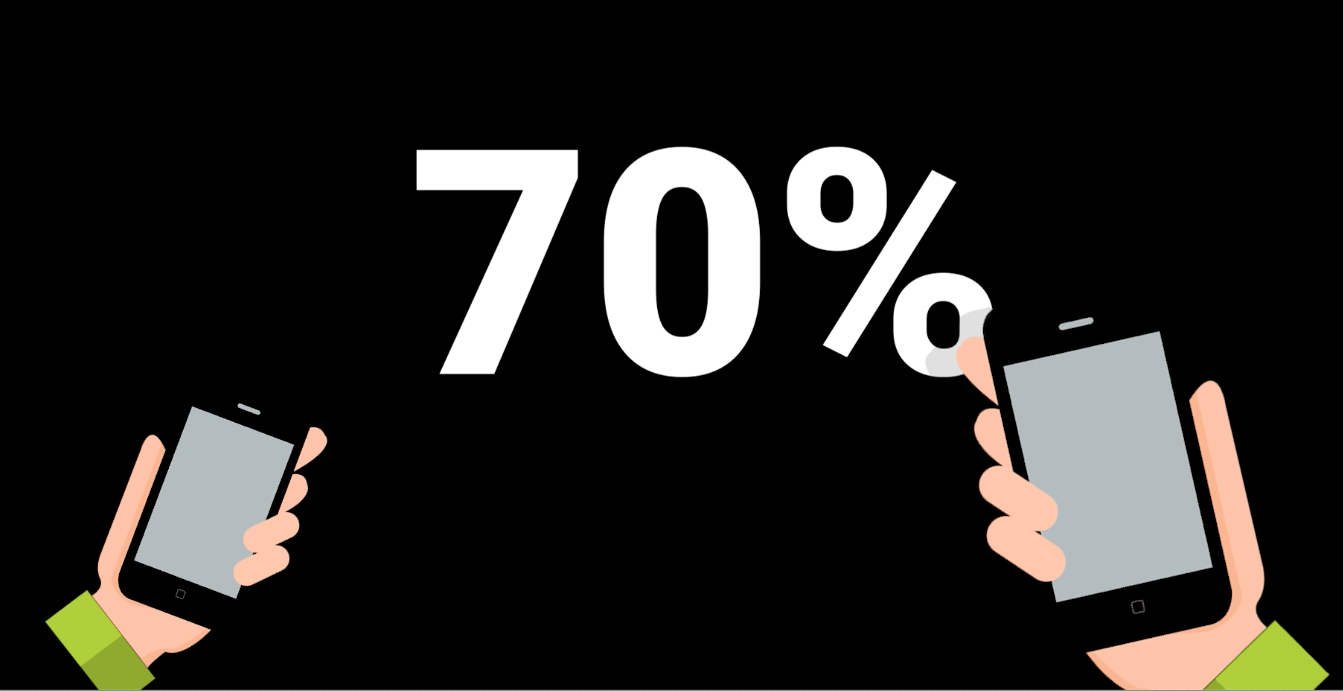
Our analytics show that nearly 70% of all people viewing content on MediaZilla are using mobile devices.
So we've fine-tuned the appearance of every possible button style combination so that it looks fantastic on mobile devices!

We also made a small tweak to how your company branding is displayed on mobile in portrait orientation. So if you've enabled branding on a collection, we've relocated your logo from the bottom-left corner to the top-center against a solid background for optimal visibility, access, and aesthetics.

Another change we made is that vertical buttons are now vertically centered on the screen (on desktop) along with the titles for optimal composition. Previously they were aligned to the top of the screen, which didn't look the best when there were only a couple buttons on the page.

And last, we've created an advanced collision detection system with the titles, which prevents them from colliding with each other and the button navigation (if possible), all while staying inside the safe area. This is some really cool tech our engineers built here that we'll have to write a blog about for those that are interested.

These new features and layout changes are also supported in our Apple, Android, and Amazon apps for a consistent experience across all of them.

Well that’s it for Collections 2.0 on MediaZilla. As you’ve seen, no other platform comes close to offering this level of customization for premium video delivery in such a fast and streamlined way.
If you haven’t checked these features out yet, go do it right now. They’re so fun to play with.
If you don’t have an account yet, you can sign up for free.

If you already have an account, you can go update old projects, spice them up a little bit, or get started on a new project.
